Life in Sync
Each design encapsulates the essence and values of your brand while offering a unique visual representation.
Font used: Noto Serif Japanese (except for #7)
Synchronicity Sphere.
Growth Rings. Harmony Circles.
This design represents the holistic journey of growth and transformation in hypnotherapy. Each circle symbolizes a step forward in personal development, starting from the innermost circle and expanding outward.
As the circles grow in size, they reflect the progressive nature of self-discovery and healing. The formation of the big circle signifies the attainment of wholeness and integration, where all aspects of the self come together in harmony.
Overall, this logo embodies the transformative process of hypnotherapy, guiding individuals towards a complete and balanced state of well-being.
Golden Ratio
This logo features four circles using the Golden ratio, each contained within the other.
This design symbolizes the concept of inner wholeness and harmony in hypnotherapy. The nested circles represent the layers of the self, with each circle representing different aspects of one's being—physical, mental, emotional, and spiritual.
The Golden ratio, known for its aesthetic appeal and mathematical significance, highlights the interconnectedness and balance between these aspects. The concentric arrangement suggests a journey towards the core of one's being, where true alignment and integration are found.
In essence, this logo represents the transformative process of hypnotherapy, guiding individuals towards a state of inner coherence and holistic well-being, where all parts of the self are in sync.
Escape from the maze
The logo features a maze formed from the initials "L" and "S" of your brand.
This symbolizes the intricate journey of self-discovery and personal growth that your clients undergo through hypnotherapy.
The maze represents the challenges and obstacles one may face in life, while the initials suggest finding alignment and harmony amidst the complexities.
The dot outside the maze, replacing the "i" in "in," signifies breaking free from the struggles and limitations, leading to synchronization and balance.
Overall, this logo embodies the transformative process of navigating life's maze to achieve inner harmony and well-being.
The Sun
The symbol of two horizontal curved lines above and below the logo text represents the balance and harmony achieved through hypnotherapy.
Resembling a circle or sun, it symbolizes the journey of transformation and renewal that your clients embark on.
The symbol encapsulate the essence of wholeness and completeness, reflecting the holistic approach to healing and personal growth that you offer.
This symbol serves as a visual representation of the interconnectedness of mind, body, and spirit, guiding individuals towards inner peace and well-being.
Old logo vibes
The symbol of three waves in our logo represents the calming and transformative effects of hypnotherapy. Each wave symbolizes a stage of the journey: relaxation, introspection, and renewal. By refreshing the logo with three gold "closing parentheses"/waves/right-direction, we maintain continuity with the previous design while signaling a new chapter of growth and evolution.
Using a similar logo helps maintain brand recognition and familiarity among existing clients while attracting new ones. It signifies continuity and consistency in your commitment to providing effective hypnotherapy services.
Additionally, the transition from green to gold adds a touch of warmth and sophistication, reflecting your dedication to facilitating positive change and personal growth.
Overall, the refreshed logo honors your past while embracing the future, symbolizing your ongoing dedication to empowering individuals through hypnotherapy.
Bold circle
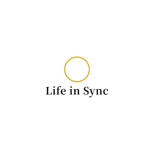
The bold, full-color circle in our logo embodies the essence of unity, harmony, and inner balance.
As a symbol of wholeness and completion, it reflects the transformative journey of self-discovery and empowerment that hypnotherapy facilitates.
The full color represent the richness of human experiences, while the circular shape signifies the cyclical nature of growth and renewal.
Our logo encapsulates the holistic approach to healing and personal development that Life in Sync offers, inviting individuals to CONFIDENTLY embark on a journey of inner exploration and transformation.
Sans serif font
Same meanings as the above.
As for the choice of a sans-serif font, it aligns with Life in Sync brand's modern and approachable identity.
Sans-serif fonts are known for their clean, minimalist appearance, which communicates simplicity, clarity, and contemporary style.
This font choice enhances readability, especially in digital formats, and conveys a sense of openness and accessibility to your clients. It complements the simplicity and versatility of the circle symbol, creating a cohesive visual identity that resonates with your audience.
Perfect circle
Simplicity. Unity. Elegance.
The circle in our logo represents unity, wholeness, and the cyclical nature of life.
In hypnotherapy, it symbolizes the interconnectedness of mind, body, and spirit, as well as the journey of self-discovery and transformation. The simplicity of the circle reflects the clarity and focus achieved through hypnotherapy, guiding individuals towards inner balance and harmony.
It serves as a visual reminder of the core/infinite potential within each individual and the holistic approach to healing and personal growth that you offer.
Fibonacci spiral flower
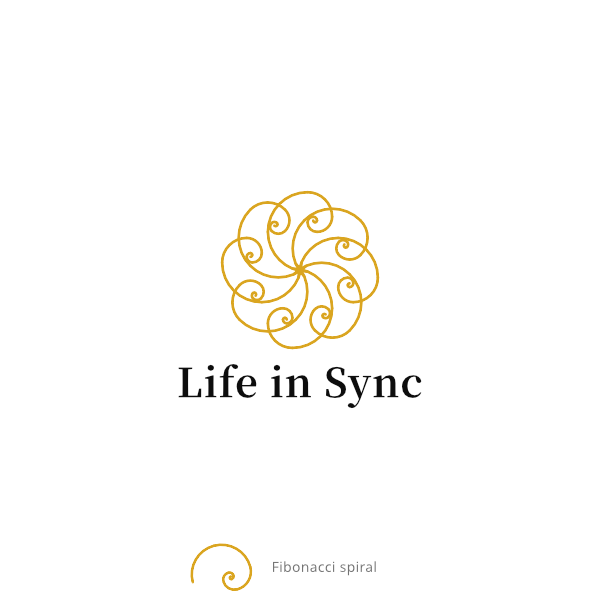
The Fibonacci spiral, derived from the Fibonacci sequence, is a geometric pattern found abundantly in nature, reflecting harmony, growth, and balance. This spiral appears in various natural phenomena, from the arrangement of petals in a flower to the structure of galaxies in the universe.
The Fibonacci spiral represents the interconnectedness of mind, body, and spirit—a fundamental principle of hypnotherapy.
The use of the Fibonacci spiral in our logo serves as a powerful visual metaphor for the transformative journey of healing and empowerment that you facilitate through hypnotherapy. It conveys a sense of beauty, symmetry, and infinite possibility.
